The Technology Blogs

Creating a Memorable Logo and Visuals
Why Visuals Make or Break Your Brand
You only get one chance to make a first impression. In the digital marketplace, your logo and visual branding are that first impression. For Print-on-Demand (POD) businesses, competition is tough. Attention spans are short. A strong visual identity is not just a nice-to-have; it’s a must.
Imagine walking into a shop where nothing matches — the sign is Comic Sans, the shelves are neon pink, and the price tags are written in crayon. Confusing, right? That’s what inconsistent visuals do to your brand.
This post explores logo design and visual branding. It offers practical tips, real-world examples, and expert strategies. Use these insights to make your POD store recognisable, trustworthy, and unforgettable. Whether you’re starting from scratch or refining your current look, this guide will show you how to:
- Craft a logo that sticks in people’s minds
- Build a visual brand system that works across platforms
- Achieve instant brand recognition
Ready to turn scroll-stoppers into loyal customers? Let’s go.

What Is Visual Branding?
More Than Just a Logo
Visual branding is the entire visual language your brand uses to communicate. It includes:
- Logo
- Colour palette
- Typography
- Iconography
- Imagery style
- Layout and spacing
These elements work together to create a unified experience on your website, packaging, social media, and product listings.
Why It Matters
- Builds trust: Consistency signals professionalism
- Boosts brand recall: Recognisable visuals stick
- Improves conversions: Clear, appealing design influences buying behaviour
Studies show people remember 80% of what they see and only 20% of what they read. Your visuals literally speak louder than words.
Read: Creating Unique Designs That Sell.

The Psychology Behind a Great Logo
What Makes a Logo Memorable?
A great logo is:
- Simple
- Relevant
- Scalable
- Distinct
Logo Types to Consider
- Wordmarks (e.g., Google)
- Lettermarks (e.g., HBO)
- Icons or Symbols (e.g., Apple)
- Combination Marks (e.g., Adidas)
- Emblems (e.g., Starbucks)
Combination marks give POD sellers flexibility and quick recognition. You can use the icon for product tags and the wordmark for your storefront.
Colour Psychology
- Red: Bold, passionate, urgent
- Blue: Trustworthy, calm, professional
- Yellow: Cheerful, creative, energetic
- Green: Natural, peaceful, eco-friendly
Choose colours based on your brand’s emotion and audience, not just personal taste.
Designing Your POD Logo
1: Define Your Brand Personality
Answer these questions:
- Who is your target audience?
- What vibe should your brand give off? (e.g., quirky, professional, bold)
- What makes your POD store different?
2: Choose Your Logo Style
- Wordmark for a minimalist brand
- Symbol for product tags or favicon
- Combination mark for maximum flexibility
3: Sketch Concepts
Don’t worry about artistry — just get ideas on paper. Think about:
- Symbols related to your niche
- Typography choices
- Layouts (horizontal vs. stacked)
4: Use a Logo Design Tool
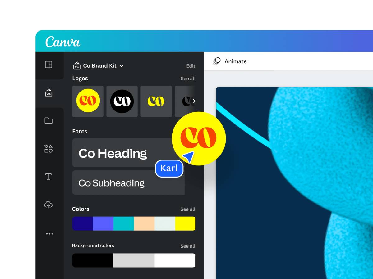
- Canva: Great for beginners
- Looka: AI-assisted design
- LogoMakr: Custom icon + font combinations
- Adobe Illustrator: Pro-level flexibility
5: Test and Refine
- Ask for feedback from your audience
- See how it looks on mockups (shirts, mugs, business cards)
- Ensure it’s readable in small sizes (like social icons)
Building Your Visual Branding System
Core Components
- Colour Palette
- Choose 2–3 primary colours and 1–2 neutrals
- Use tools like Coolors or Adobe Colour
- Typography
- One headline font
- One body text font
- Bonus: a script or decorative accent font
- Image Style
- Real photography or illustrations?
- Flat-lay or lifestyle imagery?
- Filter or tone applied?
- Graphic Elements
- Icons
- Patterns
- Line styles
Create a Brand Style Guide
Include:
- Logo versions
- Colour codes (Hex, RGB, CMYK)
- Font pairings and usage
- Image guidelines
Use it for:
- Social media templates
- Packaging inserts
- Website consistency
Real-Life Branding Wins (Case Studies)
Case 1: “Nerdy & Nice” POD Store
- Visual Identity: Clean typography + pixelated icons + pastel palette
- Logo: Retro joystick symbol + typewriter font
- Result: Instant recognition from gamer/fandom audiences. Their stickers and notebooks get reorders purely due to the design.
Case 2: “WanderPrints” Travel Apparel
- Visual Identity: Earthy tones + sans-serif font + polaroid-style photos
- Logo: Compass + script font combo
- Result: Customers share product unboxings on Instagram just because the aesthetic is so strong.
Case 3: “Bold Mindz” Mental Health Tees
- Visual Identity: Monochrome palette + geometric shapes + motivational typeface
- Logo: Abstract head silhouette with bold text
- Result: Brand gets tagged constantly due to the recognisable style.
Visual Branding Mistakes to Avoid
- Copying trends blindly — You’ll blend in, not stand out
- Inconsistency — Confuses your audience
- Too much clutter — Simplicity scales better
- Ignoring mobile layout — Check legibility on phones
- Choosing style over substance — Make sure visuals support your brand message
Tools and Resources to Get You Started

Free Tools:
- Canva (logo + branding kits)
- Looka (AI branding assistant)
- Coolors.co (colour palette generator)
- Google Fonts (free, web-safe fonts)
Paid Tools:
- Adobe Illustrator (pro design)
- Creative Market (premium templates)
- Logo Package Express (for exporting logo kits)
Implementing Visuals Across Your POD Store
Website and Shopfront
- Use the logo in the header and favicon
- Keep colours and fonts consistent
- Match your mockup background to your brand tone
Product Listings
- Use branded templates for product images
- Add logo subtly to lifestyle photos
Social Media
- Use a consistent filter, tone, and text overlay style
- Logo as profile pic or highlight cover
- Story templates in your brand colours
Packaging (if applicable)
- Branded stickers or thank-you cards
- Consistent wrapping or tissue paper colours
Conclusion: Make Your Brand Impossible to Forget
A great logo and visuals aren’t just flashy. They should be consistent, recognisable, and connect emotionally. In the POD space, visual branding is the glue that holds your customer experience together.
By investing in thoughtful logo design and cohesive visual elements, you’ll:
- Build stronger brand recognition
- Attract more attention
- Increase buyer trust and loyalty
Start small if you must — but start smart. The visuals you create today could be the reason someone clicks “Add to Cart” tomorrow.
Ready to make your POD store visually iconic?
- Audit your existing visuals using this checklist
- Try designing a new logo variation this week
- Show your followers your brand makeover journey. They’ll enjoy the behind-the-scenes look!
- For more information on branding, read: Building a Strong Brand for Your POD Store.


